Kompania Piwowarska’s new logo
21.11.2017

All materials are intended for adults over the age of 18 only and should not be passed on or made available to persons under the age of 18.

KP has decided to refresh its logo, so it better reflects the company’s past as well as the future and simultaneously says more about the employees and about what they do. The new logo combines tradition and brewing heritage, knowledge and experience of the brewers, their passion for beer and quality standards, as well as the natural character of the resources and traditional character of the recipes. The new trademark symbolises responsible sales, promotion and advertising, and reflects that we take good care of our consumers, the environment we leave our footprint on, and the people we operate among.
Our love for beer is reflected in the heart motif and the most important ingredients of beer are represented by the water drop and the hop cone. All together, it creates a modern, simple and distinctive logo in an elegant golden colour, which is instantly associated with brewing, its rich tradition and the best quality of beer. The logo functions in two versions – with the full name of the company and the KP abbreviation. Besides the shape, the change encompassed the font and company colours. The concept and execution of Kompania Piwowarska’s new visual identification was taken care of by Double Brand the agency.
Currently, the new logo is the only official trademark of Kompania Piwowarska. The previous signage in communication messages will be gradually and consistently replaced.
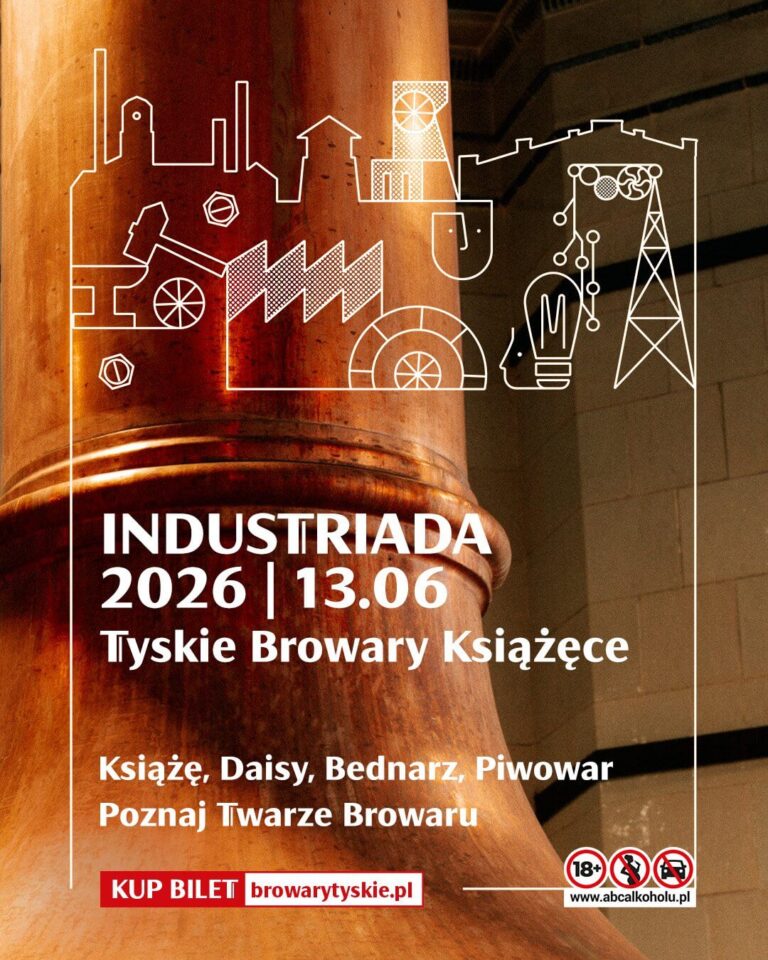
Tyskie Browary Książęce invites everyone to INDUSTRIADA 2026

Żubr once again recognized by retailers. The brand was awarded “Złoty Paragon 2026” and retains sales leadership

Winners of the “Adaptation for Wielkopolska 2026” competition announced. Three local governments receive funding for climate change adaptation projects